Inspiration is Everywhere, Everywhere is Inspiration
- Ashlyn Hernandez

- Feb 23, 2019
- 6 min read
It's no secret designers take bits and pieces from somewhere to create an interior. While there are many different ideas you can find by scrolling through a search engine like Google or Pinterest, there's nothing like adding a personal touch by applying a certain element you came across. This can be a thought or something you encountered, a person, place, or thing... it can be anything. In the consultation process, you find answers to the questions you make in order to pinpoint what your client is looking for. You may even find out that your prospect likes to travel and is in love with the warm hues of the Sahara Desert and the wavy texture in its sand. That is an opportunity to create something unique and will set you apart from the rest.
Wherever I go, whether local or a different country, I tend to look at my surroundings and find objects appealing to me. As an avid traveler, one of the most important things I bring with me (aside from my passport) is my Canon camera. Most of my shots are of objects I see and places I've gone to that I find beautiful and as a potential source for a design concept. I always encourage people to get out there and explore the big world for multiple reasons, but in the design world, it becomes a beneficial hobby if you're in need of a fresh perspective.
While I did promise to be a more active blogger, it's been a whirlwind to just sit down one day and gather up thoughts... in a good way though! Lots of things going on at the office (both at the retail design firm I work at and my own office at home), resulting in a design post hiatus. I felt it was a good and valid excuse to wait until now to share this new blog post as I just flew back from Iceland this past Tuesday, and boy was it AMAZING! Sure it was freezing, but the weather conditions didn't stop me from exploring what this breathtaking Nordic country has to offer. There, I found many sources of inspiration and also learned that some of Iceland's architecture derived from its atmospheres. I'd love to share some shots I took with you and talk about what could be taken from the objects in these images to apply them into design.

Right after our 5-hour flight from Newark to Reykjavík, we took a short bus ride to none other than the Blue Lagoon. This famous spa houses geothermal pools that are open all year round and is considered one of the 25 wonders of the world, and what a wonder it was. Aside from relaxing in the hot springs being an enjoyable experience, the entire place is quite a sight from its light blue sulfuric waters to its rocks covered in snow. The hues of light blue, white, and dark grey are sure to create a relaxing palette that can bring serenity into any interior. In color psychology, blue is considered a calming color and is widely seen in a variety of places where relaxation is preferred. Most spas contain these colors and natural textures to bring forth that earthy atmosphere, which is why many people prefer to bring the same atmosphere home to their bathrooms.

I closely associate this with the Blue Lagoon as the colors relate and create a soothing bathroom. The whites from the marble tile and the tub bring vibrance and compliment the light blue walls, while the black faucets and decorative trims add a lovely contrast.

After spending 4 hours at Blue Lagoon, we were off to Akureyri. Since one of the main things we wanted to see were the Northern Lights, we planned to fly to a city East of the capital to have a better chance of seeing them. Before we set foot on the plane, I took a glance at the city only to see a beautiful cotton candy sky with snowy mountains.

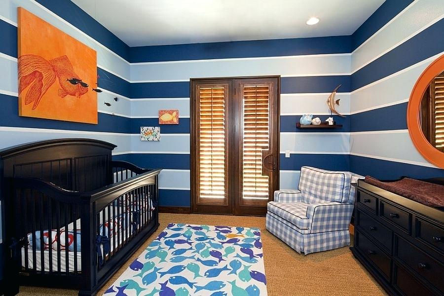
Pink or blue, which would you choose? How about both! This color combination contains a sense of calmness brought in by blue again, but this time adding a fun and flirty touch with some dusty pinks. Add in some greys and whites to mediate the two cotton candy tints and you're good to go.

From our Akureyri Airbnb, we put on our warmest gear and ventured out to Goðafoss to see the roaring water fall into a majestic river. Again, we see those Blue Lagoon colors and textures here, only this time the blue was much richer and closer to a turquoise.

Lots of neutrals here, broken up with the use of interesting patterns and textures. The turquoise in this living room adds a pop of colors, livening up the space and making it less of a serious atmosphere.
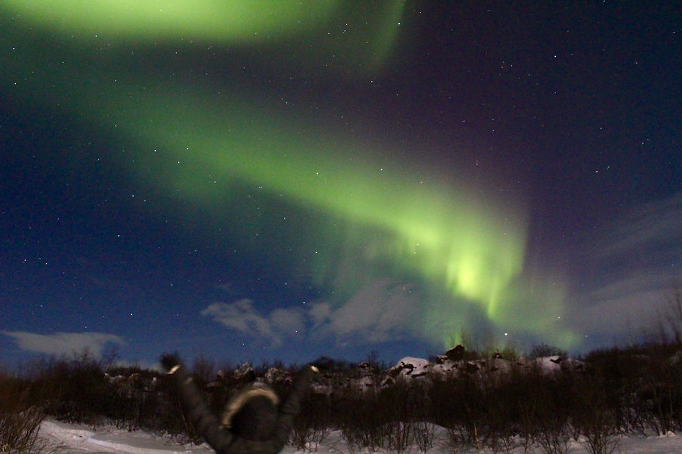
One of the main reasons I went to Iceland was to fulfill my dream of catching the Northern Lights. Oddly enough, you actually don't see the green color with your naked eye! Hate to burst your bubble here, but the Northern Lights are actually grey when you look at them. Our eyes are set up to see darkness when the night falls while charged particles from the sun strike atoms in Earth's atmosphere, resulting in the electrons inside the atoms to move to a higher energy state. According to EarthSky, once the electrons drop back to a lower energy state, they release a photon light, otherwise known as the Aurora Borealis, or commonly known as the Northern Lights. I'm going all science mode on you, but the Aurora only appears to us in shades of grey as the light is too faint to be sensed by our color-detecting cone cells, which can detect color in the daytime.

From one Nordic country to another, the Nordic Light Exhibit was held at the Nordisca Museet in Stockholm, Sweden. It's pretty obvious they are recreating the Aurora in an interior, but what I can grasp from this picture is how the lights create a soothing ambience inside the museum. Oftentimes, we see this type of light installation in living rooms and bedrooms as well as restaurants and nightclubs. This helps set the vibe and create a more intimate space.

Before we left Akureyri, we drove to a few places and one of them was this obnoxiously bright orange lighthouse. It was probably one of the most stinking cute little structures I've seen. Kind of like a Chihuahua: it's adorable, yet barks at you from a mile away.
If you studied color, you may have also learned that blue and orange are complementary colors, meaning they are complete opposites on the Munsell color wheel. This can either be a blessing or a curse. Like red and green, one shade of blue and one shade of orange may not look so good together if they are the only colors involved. You will need to balance it with perhaps a different shade of those colors, and neutrals will be your best friends here. Whoever designed this did a great job adding the brown and espresso tones here, although I probably would have gone with a different rug.

As much as I wished they were real diamonds, the washed up chunks of ice play around with contrast against the black sand. As minimal as it sounds, theres something about the black and white here that's captivating.

In here, it's all about high contrast. While white subway tile is always a good idea (at least for me it is), the black wood cabinets bring a yin-yang feel to the space and balance nicely against the white.


Finally, one of the most captivating places I visited during my stay was Reynisfjara, otherwise known as the Black Sand Beach. If you are a die hard Game of Thrones fan like I am, you probably noticed this location was used as Eastwatch-by-the-sea, which was aired on Season 7. Despite risking your life here due to the deadly tide, the scenery is far more than breathtaking.

If you follow me on Instagram, you probably already saw this shot. Before we flew home, we drove back to Reykjavík for two nights and got to take in what this little city was about. Although it was a bummer I didn't get to go up the tower, I still got to see the beautiful architecture of this church, both outside and inside. According to the sources, the making of this landmark was inspired by nature, thus incorporating the monstrous basalt columns of Reynisfjara into the architecture of this building. Just as the basalt columns rise up to the heavens, Hallgrímskirkja mimics the same motion with the stepped and faceted pattern. How lovely it is to see Guðjón Samúelsson take inspiration from nature. Fun fact: this church took 41 years to complete.
Although you don't need to fly far to get inspired, it's still a great idea to do so as there may be something out there you can't find closer to you. As a designer, you want to be as unique as possible as there are many of us. It's up to you to create an alternate ending to your design story. Can't wait to decide where I'm off to next!
XO,

Comments